“Your bottles are so cute.”
If you like our happy bottles, meet the gal behind their design!
Hello, my name is Kelly! I’m the designer for Brewt’s so if you’ve looked at one of their bottles, you have seen my work (my flamingo, jalapeno, lime filled work). I wanted to share a bit about my process and what it’s like to help create the visual identity for our products and beyond.
It’s been an amazing journey to work alongside Emily and Luke as they grow their brand. I love that I have been along for the ride…to see the ways the business continues to grow is rewarding. They have created a fun, creative, and collaborative environment which is everything you could ask for especially when it comes to my line of work. I love that there’s always something new coming my way; it allows me to stay challenged in my designs while also continuing to help develop our overall look.
I thought I would break down a couple of my favorite projects to help shine a bit of light into what I do and my inspiration for creating designs that continue to break the mold when it comes to the fod and beverage industry.
BILLBOARDS
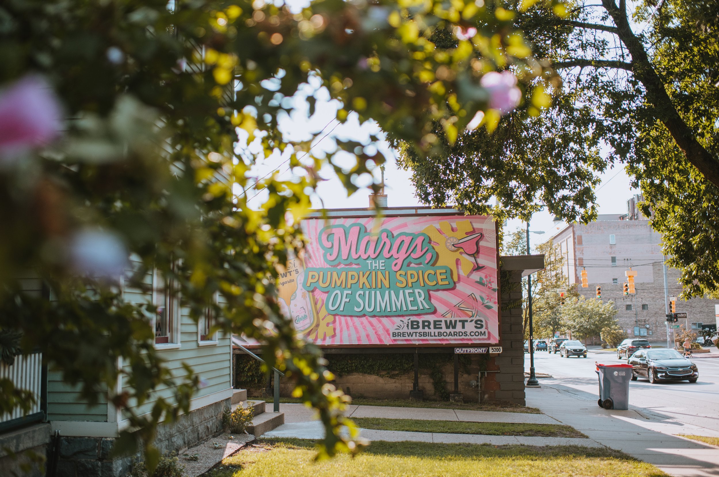
Last summer we did a massive billboard campaign all over West Michigan. I worked with Luke to create these visuals as he had a specific vision in mind. We really wanted to focus on conveying who they are. Everything from the inspiration for their name (their dog Brewtus) to their individual products. Each month featured a theme with wildly different designs for each billboard. Having them spread out across the greater Grand Rapids area allowed us to create individual advertisements featuring a theme, product, or even a nod to that particular neighborhood.
We were intentional about each advertising campaign. For example, one of them was “No Gimmicks” which allowed us to highlight how our brand doesn’t need to fall into the different labels that are floating around. No crazy fads or buzzwords here…just good products made from real, fresh ingredients.
I don’t live in Michigan, so I loved seeing the photos roll in. It was great to see the happy billboards after the time and energy we put into them. You can read more about the billboard campaign and see each design here.
MARGARITA BOTTLES
Narrowing down my favorite design of all time is hard, but if I had to choose, I would go with designing the margarita labels. They were each unique and a new direction from what we had done in the past. They had to stand on their own, but still remain consistent with our Bloody Mary and hot sauce labels. It posed an exciting challenge to create the look of an entirely new product that we knew would be popular with our Brewt’s fans. We wanted them to be bold, bright, fresh…and still fit in seamlessly to our suite of products.
When brainstorming, Emily and Luke expressed wanting to bring their love for Palm Springs, CA into their Michigan based brand. To pay homage to this area, we used flamingos, cacti, and palm trees to represent elements that everyone thinks of when they’re dreaming about this part of California. To reinforce this even more, our color palette stemmed from a pastel base with bolder pops of color; just like the beautifully bright colored doors you can find all over Palm Springs.
My favorite part of the project was being able to use die cuts! We wanted to highlight the all-natural mix as well as quickly represent the fact that it’s a margarita mixer. It seemed like the perfect opportunity to use a die cut of a marg glass.
I had so much fun creating this new visual. We love to see that people respond to the bottles just like we did when we first saw them. The first bottle’s design process was my favorite-diving into this new world was exciting. But, out of all of the margarita labels, I would have to pick the Lavender as my all time favorite. Again, tough choice, but the first limited edition, lilac design takes the cake.
I hope you enjoyed learning a bit more about my process. Stay tuned, there’s more design fun to come!
Thanks for reading along,
Kelly
*Kelly is a Senior Graphic Designer with 11+ years experience directing creative graphic design projects that revolutionize business’ brands. She is known for conceptualizing and producing eye-catching print, packaging, digital, infographics, tradeshow and publication designs. She describes herself as an out-of-the-box thinker committed to generating, providing, and executing innovative design solutions and unique ideas across a range of projects. Design continues to be a love of hers as she continues on a constant path of learning and growing both personally and professionally. Outside of work, you can find her outside on hikes, at the beach, at a concert, enjoying a winery, or spending time with her family: her boyfriend Owen, their little 4 year old, and their two dogs: Dylan and One-Eye'd B. Connect with her on Instagram @ohheydesigns.


